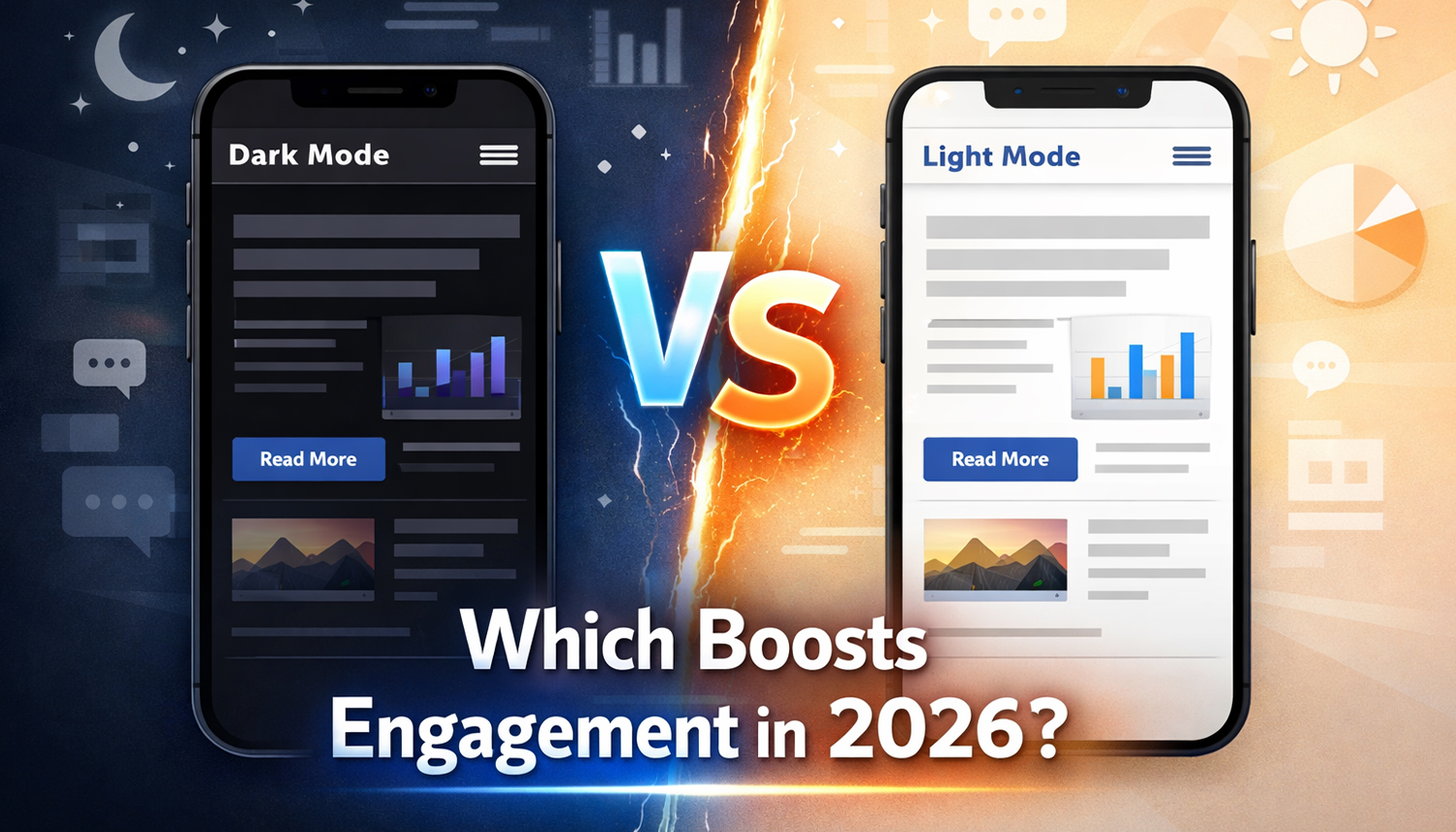
Dark Mode vs. Light Mode: Which Boosts Engagement in 2026?
- December 29, 2025
- Post By: Alex Mariyan Sebastian
Dark mode has become popular over the past few years due to a variety of reasons. One of them is battery life, which is a significant factor for the users of OLED smartphones that conserve power by turning off pixels. A lot of users have the opinion that dark themes do not strain their eyes, particularly at night.
On the other hand, the bitter truth is that websites that are only light mode compatible are reaching the least possible audience. It is not due to the poor quality of the content, but the burning sensation in the users’ eyes.
Why Dark Mode?
Dark Mode is a display setting where the background is dark with a light font. We are all used to the reverse, which is the dark text on a light background in the classic Light Mode. What used to be a design gimmick only a few years ago has turned out to be the default setting of numerous users.
The change extends much further than aesthetics. It concerns comfort, energy saving, and, finally, improved user experience. In the case of companies in Dubai and the UAE, it implies that companies that do not provide their users with this option might lose their competitive advantage.
What’s the relation between dark mode and user behaviour?
The numbers speak for themselves. According to recent studies, over 82% of smartphone users use Dark Mode on their devices.
When we refer to engagement rates, it becomes even more interesting. By using a customised dark theme, a Brazilian media company known as Terra was able to decrease its bounce rate by 60% and its number of pages viewed in session by 170%. These are significant numbers that indicate that Dark Mode has a direct relationship with the key KPIs.
What’s behind this? Dark Mode is more comfortable for its users. They take their time; they will have more clicks and will engage more with the content. This is mainly so to individuals who use the internet on a nightly or evening basis, which is becoming very common in our globalised world.
What Are The Advantages of Dark Mode for Your Website?
Less Eye Strain
Many people are spending several hours daily staring at screens. This is resulting in fatigue and discomfort in the eyes. Dark Mode makes the difference between the screen and the environment around it, particularly in the case of dark rooms, less noticeable.
Users report less eye strain when using Dark Mode. Apart from being nice, it is also a good thing for the body. For a web design company in Dubai that puts user-friendliness at the top of its priorities, this is a significant benefit.
Longer Device Battery Life
On OLED screens, Dark Mode consumes significantly less energy. The reason is simple: with OLED, each pixel lights up individually. Black areas remain completely dark because the pixels are switched off. This saves power.
According to research, Dark Mode can reduce energy consumption by 39% to 47% when the brightness is set to 100%. For users who are often on the go, this is a real added value. Longer battery life means more time spent on your website.
More Personalisation and Control
In digital marketing, personalisation has become an essential aspect since most businesses argue that personalisation is the key element in achieving success. However, only 52% of them provide the respective customisation opportunities on their websites.
The presence of a basic toggle between a Light and Dark Mode provides users with the feeling of control. They have the freedom to choose how they would prefer your content. Such freedom of choice allows brand loyalty, and the user experience is vastly enhanced.
Improved Accessibility
People usually take accessibility as an underrated requirement. The websites do not consider contrast, voice control, or alternative navigation, meaning these people are excluded.
Dark Mode can be useful and is useful in the case of people with astigmatism or cataracts. The text and background are less contrasted, and reading is easier. Not only does this make it socially responsible, but also new target groups are opened up.
When is Dark Mode the right choice?
Dark Mode isn’t suitable for every website. The decision depends on several factors. Here are some scenarios where Dark Mode is particularly beneficial:
Long usage times
Platforms designed for extended sessions benefit greatly from Dark Mode. Think of news portals, streaming services, or social media apps. Users often spend hours on these platforms. A darker design reduces eye strain and keeps people on the site longer.
Frequent interactions
Daily used apps and websites must have Dark Mode. This category includes messaging, productivity or email services. In case users visit your platform several times a day, comfort becomes an essential issue.
Use in low light
There are those services which are mainly utilised in the dark. The most exemplary is streaming services. No one would like to see the bright screen when viewing a film at night. Dark Mode is not only lovely here, but, in fact, it is needed.
Text-heavy content
Dark Mode is beneficial to websites with a high number of text or data visualisations or code. The rationale: pictures and videos are barely dependent on the colour scheme. Instead, text is made more readable and eye-friendly.
What Are the Common Mistakes When Implementing Dark Mode?
Even experienced designers make mistakes when implementing Dark Mode. Here are the most common problems and how to avoid them:
Poor Adaptation of Graphics
Logos and images often disappear against a dark background if they are not properly adapted. Use scalable formats like SVG that support transparency. This ensures your graphics remain visible and sharp on any background.
Readability and Typography
Thin or light fonts are difficult to read on dark backgrounds; they practically disappear. Choose slightly bolder font weights and ensure sufficient spacing. This keeps your text clear and easy to read.
Inconsistency Across Channels
Mobile apps often contain outbound links that open in a browser. When a user switches from a dark app to a light website, it’s jarring. Ensure your web presence is consistent.
Lack of Accessibility Testing
Many Dark Mode implementations fail to meet WCAG contrast standards. This means that content and icons are not readable for some users. Always test contrast ratios and readability in various lighting conditions before going live.
Unreadable QR Codes
Inverted QR or barcodes are not recognised by some devices. Use consistent image formats like PNG that maintain the correct contrast in both modes. This ensures your codes always work.
Why Is Dark Mode Important In the Future?
Since most users have already activated the Dark Mode on their smartphones, its impact will only increase. The following are some of the trends that we envisage in 2026 and beyond:
AI-driven personalization
Artificial intelligence will be significant. Adaptive colour systems had the capability of automatically adapting to user behaviour or the time of day or the ambient light. It will be up to your site to decide when to use Dark Mode.
Adaptive design modes
There will be more responsive interfaces. They were capable of reducing or increasing brightness, tone and contrast in real time to suit the conditions of viewing. This is much more extensive than a mere on/off switch.
Evolving user expectations
By the end of the decade, Dark Mode could be considered a standard for accessibility and energy efficiency. It will no longer be seen as a style preference but as a fundamental feature.
Design maturity and innovation
Future Dark Mode will focus on experiences that adapt to human comfort. This combines aesthetic depth with performance and adaptability. The focus shifts from appearance to functionality.
When should you avoid Dark Mode?
Dark Mode is not always the most suitable solution, despite all its benefits. These are some of the cases in which you ought to be keen:
Bright brand identity
Dark Mode might not be appropriate for your brand that is based on bright, airy, or pastel colours. This is particularly so with the wellness products, children’s products or the hospitality industry. Brightness in these industries portrays optimism and friendliness.
Use in daylight
Dark Mode is not applicable to products that are mostly used outside or on sunny days. Quite on the contrary, it is sometimes hard to read on the dark screen in the daytime.
Colour-intensive product photos
Dark Mode may distort the colour balance of your content in case you are over-relying on bright product images or photography. It is especially vital in the case of e-commerce websites, where the correct display of goods plays a vital role.
Conclusion
Dark Mode adoption is not a passing trend that will soon disappear. It is a fundamental feature for every website, app and software.
If you are looking for a web design company in Dubai or a web design company in the UAE that can help you stay modern and user-friendly, Inter Smart is the right choice. We combine technical expertise with creative design and local market understanding.
The first step is simple: analyse your target audience. How do they use your website? When and where do they access your content? The answers to these questions will show you whether Dark Mode makes sense for you.
Then comes the implementation. This is not just a technical project but a strategic decision. It’s about creating a better user experience that strengthens your brand and supports your business goals.
Get A Call back from Our Expert
Need tailored guidance or have specific questions? Simply request a callback, and one of our knowledgeable experts will reach out to you at a time that suits your schedule.