


Inter Smart
Talk to our expert today
Visiting a website where you can interact directly with content, with colors that respond to your actions, and layouts that change based on what you see is the new thing. By 2025, websites will be more dynamic and adaptable, powered by AI, spatial computing, and understanding human needs. As people’s attention spans shrink and a main part of first impressions depends on design, these changes will boost user engagement, build trust, and positively impact your business. Ignoring these trends could make your website quickly outdated. Let’s explore 10 Modern Web Design Trends for 2025.
Custom illustrations are unique artworks that are now replacing common Stock images from websites. They are designed to show a company’s identity by combining traditional drawing with digital tools. By 2025, they will include features like color gradients, paper textures, and 3D effects. These illustrations avoid clichés and make websites feel more personal and consistent than stock photos. This trend helps people remember brands better and creates emotional connections. Expect more animations that make images interactive, turning passive viewing into engaging stories.
Notion uses unique, custom illustrations throughout its website to explain ideas in a friendly and consistent style. The drawings include hand-drawn characters and scenes that show how the product works.
Full-page headlines comes with powerful images and precise text to fill the first screen. Important messages and call-to-actionss are placed on the left, where the eye naturally lands, and on the right, they combine them with eye-catching images or videos. This design immediately directs attention by utilizing the “F-pattern” reading habit. Anticipate micro-animations that give headers a sense of life in 2025, such as hovering effects or delicate motions. The objective? Grab attention in less than three seconds while maintaining a clutter-free website tone.
The Verkada website starts with large sections covering the full screen. On the left, there’s brief text, and on the right, eye-catching visuals, often with small animations.
Parallax scrolling uses different movements and speed variations for different layers in the design. When users scroll, these design tricks make the screen look three-dimensional. And, it adds depth to flat screens, which makes the content feel more interactive. This also include “depth-mapped’ features where scrolling triggers animations like shifting surroundings or revealing data. This technique is no longer just decorative; it guides users through stories and makes complex information more engaging.
Phyll features multi-layered parallax scrolling, with background and foreground moving at different speeds, and scroll-triggered animations that reveal data or stories.
“Negative space” or white space, is the empty space between design elements. Using it to group similar content, reduce mental effort, and highlight important parts is a smart strategy for 2025. Good spacing improves readability, especially on mobile devices. Expect “active white space” that adapts beautifully with screen size, which is more compact on phones for easy thumb access and more spacious on desktops for a sleek, polished appearance. It helps create a sense of rhythm and focus in your design, going beyond mere simplicity.
Slack and Sonos use well-spaced content layouts with clear sections to organize information, reduce clutter, and highlight call-to-action buttons. Motion Graphics and illustrations are added to emphasize major tools.
Playful cursors make interacting with a screen more fun. They can make sounds, look like paintbrushes, or leave trails like emojis or sparks. This makes browsing more engaging and interactive. By 2025, AI-powered cursors might change shape based on where you are, like turning into a microphone near voice search or a hand near clickable things. This uses psychology to make users enjoy their experience more.
Matildemagagnoli have playful and unique cursor effects that match their brand identity on their website, making the experience more engaging and personalized.
Accessible and user-friendly interactions are essential in UI and UX design. By 2025, this means fast page loads in under two seconds, inclusive features like dyslexia-friendly typefaces, voice navigation, and subtitles, as well as websites that adapt using device sensors to adjust text size and contrast. Mobile-first design is crucial, with thumb-friendly calls to action and streamlined menus, ensuring smooth experiences across all devices, especially since over 60% of web traffic comes from mobile.
Interactive sites like these load quickly (Corewebvitals), have mobile-friendly designs, accessibility features such as voice navigation and dyslexia-friendly fonts, and thumb-friendly buttons for smartphones (Dribble).
Instead of fixed rows, asymmetric grids arrange materials in irregular patterns like staggered cards or overlapping layers. Asymmetric grids can keep things organized while also adding visual interest for the audience. Besides, designers can control spacing across devices using different Grid. By 2025, expect “broken grids’ where photos and text intentionally cross lines for a stylish look, ideal for news sites or portfolios. This approach balances structure and freedom, making websites look dynamic yet dependable.
Sundaecreative uses broken, overlapping grid layouts with staggered cards or images crossing boundaries to create an artistic effect while still keeping some structure.
For introductory sections, full-image headers use a single, strong picture or graphic as the background. The contrast is high, so the text and buttons are easy to read. This design grabs users’ attention and creates an emotional effect before they scroll. By 2025, AI will personalize these images for different age groups and demographics. The key is to keep it simple and bold, one clear message without distractions.
Feed Music features full-screen background images, videos, and motion graphics, like smoke visuals or bold photos, with a clear message or call-to-action overlaid in high contrast.
Websites with narrative design are like stories. They reveal information as you scroll, making the experience feel engaging and emotional. In 2025, some sites let you choose different paths, seeing different results based on your decisions, like clicking options to see outcomes. This turns passive browsing into active participation. It works well for educational sites, charities, and companies promoting a cause.
BrandStudio shows sections that appear when you scroll or click, revealing information gradually and making storytelling interactive.
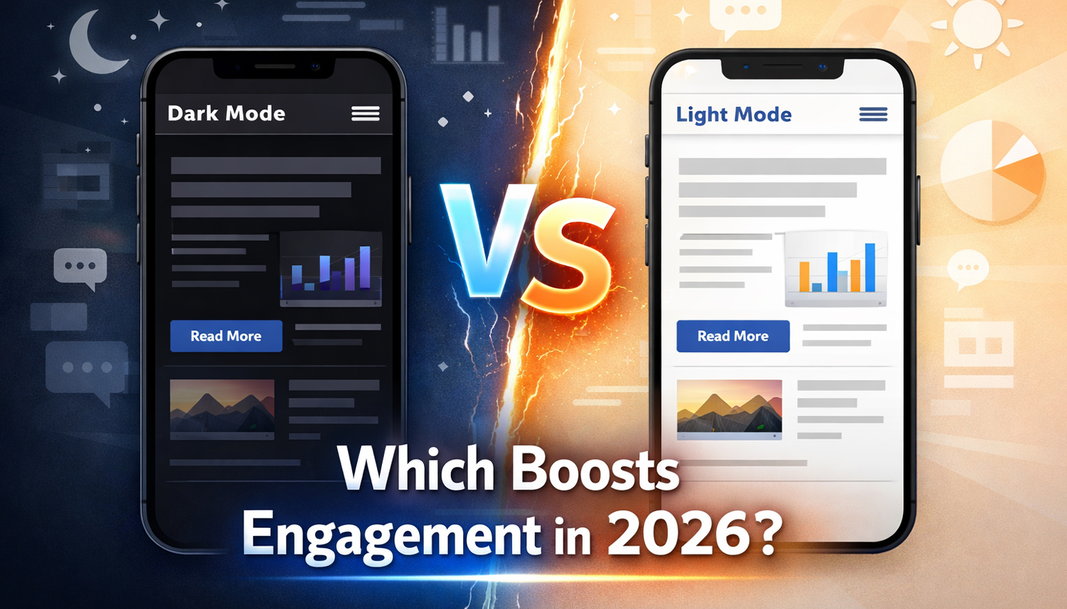
Colors serve specific purposes in the new-age web designing. A.I. Aqua, a blue-green hue, represents the harmony of technology and humanity, while subdued blues and greys help focus with gentle backgrounds. Bold reds and oranges encourage action as call-to-actions, and dark mode palettes reduce eye strain. Gradients blend these elements seamlessly. Always choose colors that reflect your company’s personality, like purple for creativity or green for sustainability.
Brands like Turbulent use gentle changes between calming and energizing colors to help shift moods during the user experience.
Chasing flashy elements and overloading is not the goal of adopting these trends. It’s about alignment. Ask yourself questions like: Does scrollytelling improve the story of your nonprofit? Will your website feel more human with hand-drawn elements? It is important to ignore a trend if it doesn’t match your audience’s values. Design is about connection instead of just appearance.
Need tailored guidance or have specific questions? Simply request a callback, and one of our knowledgeable experts will reach out to you at a time that suits your schedule.