Dark Mode vs. Light Mode: Which Boosts Engagement in 2026?
- December 29, 2025
- Post By: Alex Mariyan Sebastian
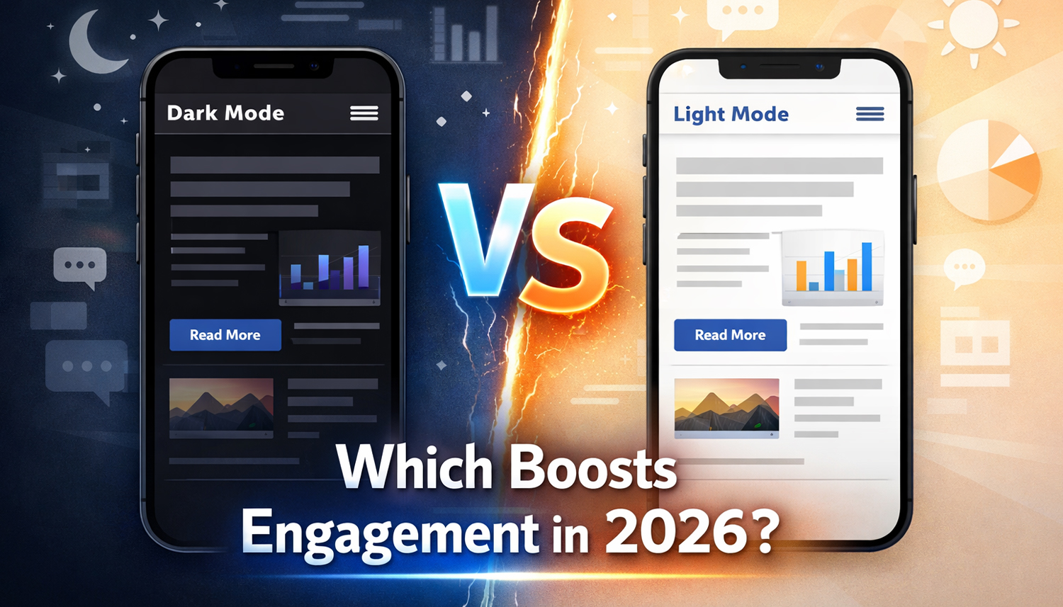
Have you ever opened a website at night only to be greeted by a bright white screen? Or struggled to read text on a dark background in a brightly lit environment? These everyday experiences highlight why dark mode and light mode have become more than just design preferences.
Dark mode is often preferred for its sleek appearance and potential battery-saving benefits on OLED displays, while light mode continues to offer familiarity and readability in many situations.
Does one mode actually keep users engaged longer, encourage them to explore more pages, or improve conversions? The answer isn’t as straightforward as you might think.
In this guide, we’ll explore the differences between dark mode and light mode, how each influences user experience, and what businesses should consider when choosing a website colour scheme in 2026.
Dark Mode vs. Light Mode: A Comparison
| Factor | Dark Mode | Light Mode |
|---|---|---|
| Low-light environments | Often more comfortable | Can feel excessively bright |
| Bright environments | May be harder to read | Often easier to read |
| Long-form reading | Depends on user preference | Often preferred for extended text reading |
| OLED battery consumption | Can reduce power consumption | Generally consumes more display power |
| Brand presentation | Works well with certain modern and media-focused brands | Works well with clean, bright and traditional designs |
| Accessibility | Requires proper contrast | Requires proper contrast |
| Visual appearance | Modern, immersive appearance | Familiar, clean appearance |
What Is Dark Mode and Why Has It Become Popular?
Dark Mode is a display setting where the background is dark with a light font and interface elements. In contrast, Light Mode follows the traditional approach of displaying dark text against a light background.
Once considered a visual design trend, Dark Mode has become a common feature across operating systems, mobile applications and websites. Its popularity is driven by several factors, including personal preference, viewing comfort in low-light environments and potential battery savings on OLED displays.
The change extends much further than aesthetics. It concerns comfort, energy saving, and, finally, improved user experience. For businesses in the UAE, offering flexible display options can help create a more adaptable browsing experience. Rather than treating Dark Mode as a design requirement, businesses should consider whether it complements their audience’s needs, website functionality and brand identity.
How Does Dark Mode Influence User Behavior?
Dark mode has gained considerable popularity among smartphone users. In a 2020 Android Authority poll, approximately 82% of 2,514 respondents said they used dark mode on their phones. Although this poll does not represent all smartphone users, it highlights the growing interest in alternative display preferences.
When we refer to engagement rates, it becomes even more interesting. By using a customised dark theme, a Brazilian media company known as Terra was able to decrease its bounce rate by 60% and its number of pages viewed in session by 170%. The results were not a general improvement across all users and devices.
The improvement in Terra’s engagement metrics highlights how a well-implemented dark theme can positively influence the browsing experience for certain audiences. However, these results should be viewed in the context of Terra’s specific audience and implementation.
| Metric | Before Dark Theme | After Dark Theme |
|---|---|---|
| Desktop Bounce Rate | 27.5% | 10.82% |
| Pages per Session | 3.7 | 9.99 |
Source: Terra’s Dark Mode Implementation Case Study on web.dev.
Key Benefits of using Dark Mode on Your Website
Less Eye Strain
Dark Mode can offer a more comfortable viewing experience in low-light environments by reducing the amount of bright light emitted by the display. However, its effect on eye comfort varies between individuals. Factors such as screen brightness, text size, contrast, viewing distance and ambient lighting also influence visual comfort. Providing both display options allows users to choose what works best for them.
Users report less eye strain when using Dark Mode. Apart from being nice, it is also a good thing for the body. For a web design company in Dubai that puts user-friendliness at the top of its priorities, this is a significant benefit.
Longer Device Battery Life
Dark Mode can reduce display power consumption on OLED smartphones because individual pixels can switch off when displaying black.
Research from Purdue University found that the savings depend significantly on screen brightness. Under typical indoor brightness levels of 30% to 50%, the tested devices saved approximately 3% to 9% of total power. At maximum brightness, the savings increased to 39% to 47%. However, these results do not apply equally to LCD screens or every smartphone.
More Personalisation and Control
In digital marketing, personalisation has become an essential aspect since most businesses argue that personalisation is the key element in achieving success.
Modern website users expect digital experiences that accommodate their individual preferences. Providing a simple toggle between Light Mode and Dark Mode gives visitors greater control over how they interact with your website.
Websites can also respect a visitor’s existing device preferences through system-level settings. This creates a more familiar browsing experience without requiring users to manually adjust the appearance every time they visit.
For businesses, these small personalisation features can contribute to better usability and make websites more adaptable to different browsing environments.
Improved Accessibility
People usually take accessibility as an underrated requirement. The websites do not consider contrast, voice control, or alternative navigation, meaning these people are excluded.
Dark Mode can provide an alternative viewing experience for users who prefer darker interfaces. However, accessibility depends on more than the background colour. Both dark and light themes should maintain sufficient text contrast, readable font sizes, clear visual indicators and accessible navigation. Following WCAG contrast guidelines helps ensure that content remains readable across different display settings.
When Should You Consider Dark Mode?
Dark Mode isn’t suitable for every website. The decision depends on several factors. Here are some scenarios where Dark Mode is particularly beneficial:
Long usage times
Websites and platforms designed for extended browsing sessions, such as news portals, streaming services and social media platforms, can benefit from offering Dark Mode. Providing an alternative display option allows visitors to choose the interface that best suits their viewing conditions and personal preferences.
Frequent interactions
Daily used apps and websites must have Dark Mode. This category includes messaging, productivity or email services. In case users visit your platform several times a day, comfort becomes an essential issue.
Use in low light
There are those services which are mainly utilised in the dark. The most exemplary is streaming services. No one would like to see the bright screen when viewing a film at night. Dark Mode is not only lovely here, but, in fact, it is needed.
Text-heavy content
Dark Mode is beneficial to websites with a high number of text or data visualisations or code. The rationale: pictures and videos are barely dependent on the colour scheme. Dark backgrounds can create a visually distinct interface and may be preferred by users working in low-light environments.
However, readability should remain the priority. Text contrast, font size, spacing and typography must be carefully considered to ensure that information remains easy to understand in both display modes.
What Are the Common Mistakes When Implementing Dark Mode?
Even experienced designers make mistakes when implementing Dark Mode. Here are the most common problems and how to avoid them:
Poor Adaptation of Graphics
Logos and images often disappear against a dark background if they are not properly adapted. Use scalable formats like SVG that support transparency. This ensures your graphics remain visible and sharp on any background.
Readability and Typography
Thin or light fonts are difficult to read on dark backgrounds; they practically disappear. Choose slightly bolder font weights and ensure sufficient spacing. This keeps your text clear and easy to read.
Inconsistency Across Channels
Mobile apps often contain outbound links that open in a browser. When a user switches from a dark app to a light website, it’s jarring. Ensure your web presence is consistent.
Lack of Accessibility Testing
Many Dark Mode implementations fail to meet WCAG contrast standards. This means that content and icons are not readable for some users. Always test contrast ratios and readability in various lighting conditions before going live.
Poor Colour Contrast and Interface Visibility
One common mistake is failing to adjust interface elements when switching between display modes. Buttons, icons, form fields, borders and navigation elements may become difficult to distinguish against darker backgrounds.
Designers should establish separate colour palettes for both themes and test their contrast ratios. Important interface elements should remain visible, interactive and consistent across different display settings.
Dark Mode and Website Design Trends to Watch Out For in the Future
Since most users have already activated the Dark Mode on their smartphones, its impact will only increase. The following are some of the trends that we envisage in 2026 and beyond:
Here are some developments shaping how websites approach dark and light themes.
System-based Theme Preferences
Websites can use device-level preferences to determine whether a visitor prefers a light or dark interface. Technologies such as the CSS prefers-color-scheme media feature allow websites to adapt their appearance based on operating system settings.
AI-driven personalization
Artificial intelligence will be significant. Adaptive colour systems had the capability of automatically adapting to user behaviour or the time of day or the ambient light. It will be up to your site to decide when to use Dark Mode.
More Flexible Design Systems
Modern design systems increasingly account for multiple colour themes. Instead of simply reversing background and text colours, designers create dedicated palettes for each mode to maintain consistency, readability and brand identity.
There will be more responsive interfaces. They were capable of reducing or increasing brightness, tone and contrast in real time to suit the conditions of viewing. This is much more extensive than a mere on/off switch.
Personalised Browsing Experiences
User preferences are becoming an important part of digital experiences. Providing theme selection, remembering user choices and respecting system preferences can make websites easier to navigate across different browsing environments.
When should you avoid Dark Mode?
Dark Mode is not always the most suitable solution, despite all its benefits. These are some of the cases in which you ought to be keen:
Bright brand identity
Dark Mode might not be appropriate for your brand that is based on bright, airy, or pastel colours. This is particularly so with the wellness products, children’s products or the hospitality industry. Brightness in these industries portrays optimism and friendliness.
Use in daylight
Dark Mode is not applicable to products that are mostly used outside or on sunny days. Quite on the contrary, it is sometimes hard to read on the dark screen in the daytime.
Colour-intensive product photos
Dark Mode may distort the colour balance of your content in case you are over-relying on bright product images or photography. It is especially vital in the case of e-commerce websites, where the correct display of goods plays a vital role.
How to Implement Dark Mode on Your Website
Implementing Dark Mode involves more than changing a website’s background from white to black. It requires a consistent approach to colours, typography, interface elements and user preferences.
Here are some important considerations:
- Create separate colour palettes: Define appropriate background, text, border and accent colours for both themes.
- Respect system preferences: Use CSS
prefers-color-schemeto detect the visitor’s preferred display setting. - Provide a theme toggle: Allow visitors to switch between Light Mode and Dark Mode whenever they want.
- Maintain sufficient contrast: Test text, buttons, icons and other interface elements against WCAG contrast requirements.
- Optimise images and graphics: Ensure logos, illustrations and other visual assets remain visible in both themes.
- Test across devices: Check how both themes appear on different screen sizes, browsers and operating systems.
- Remember user preferences: Retain the visitor’s selected theme so they do not have to change it every time they return.
A well-implemented theme should feel like a natural extension of your website rather than a completely different interface.
Conclusion: Should Your Website Offer Dark Mode or Light Mode?
Dark Mode and Light Mode both have their advantages, and neither is universally better. While dark themes can offer a comfortable viewing experience in low-light environments and reduce power consumption on OLED displays, light themes remain a familiar and practical choice for many users.
For businesses, the real priority should be creating a website that adapts to user preferences without compromising readability, accessibility or brand identity. Offering both display options, maintaining sufficient colour contrast and respecting device-level preferences can contribute to a more flexible user experience.
At Inter Smart, we believe effective website design goes beyond visual appeal. It involves understanding user behaviour, improving usability and creating digital experiences that support business goals. As a web design company in Dubai, we help businesses build websites that combine thoughtful design with functionality and performance.
Ultimately, the best colour scheme is the one that makes your website easier to use and helps visitors achieve what they came for.
Get A Call back from Our Expert
Need tailored guidance or have specific questions? Simply request a callback, and one of our knowledgeable experts will reach out to you at a time that suits your schedule.