How Focus States Affect Accessible Web Navigation
- October 16, 2026
- Post By: Alex Mariyan Sebastian
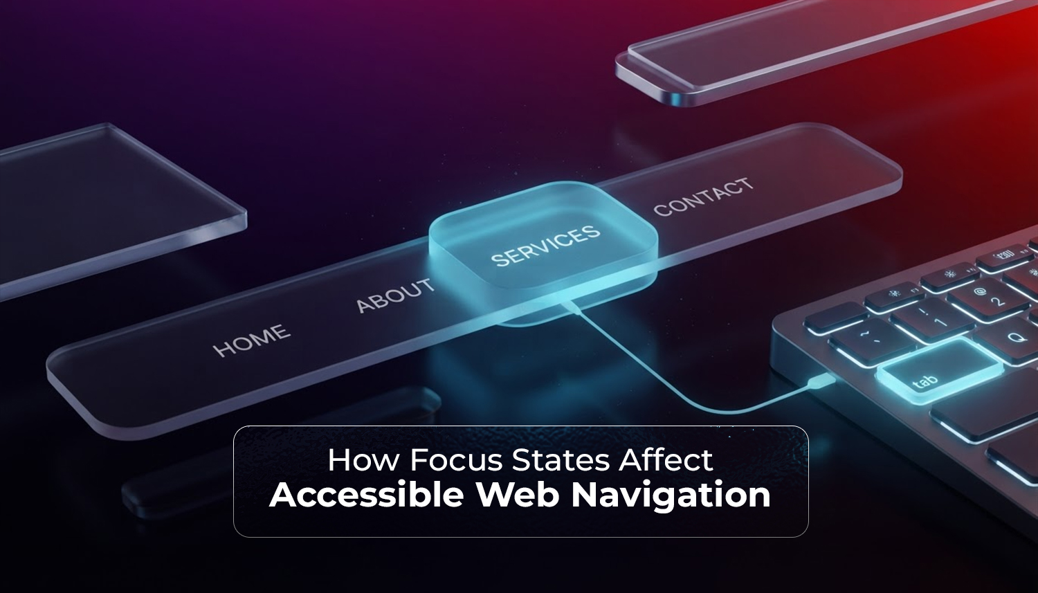
Focus states are one of the smallest design details on a website. They’re also among the most important for accessibility.
| A focus state is a visual indication of which interactive element on a screen is selected. It tells the user, ‘This is where you are right now.’ |
This article will guide you through what focus states are, why they are important, and how to implement them on your website.
Who relies on focus states to navigate?
Even though all of us benefit from focus states, some really need them to carry out online operations. Motor impairments and other paralysis conditions make mouse usage difficult, and people with these conditions mostly rely on keyboards and focus states.
Screen reader users also depend on focus order to move through a page in sequence.
The World Health Organization estimates that approximately 1.3 billion people in the world have some kind of disability. This represents 16% of the world’s population. Some do not use keyboard navigation; many do. If you design without focusing on any audience, you’re actively excluding a large part of the audience.
What do the WCAG guidelines require?
The Web Content Accessibility Guidelines (WCAG) established by the W3C provide the world’s standard for web accessibility. There are several criteria that can be applied to focus states.
The most important ones are:
- WCAG 2.4.7 (Level AA): minimum requirement: all keyboard-operable interfaces need to have a focus indicator.
- WCAG 2.4.11 (Level AA, added in WCAG 2.2): The focus indicator shouldn’t be hidden by the author.
- WCAG 2.4.13 (Level AAA): Focus indicators should have a minimum ratio of 3:1 contrast, and the focus area should be large enough.
The goal of most organisations is to achieve level AA. It includes both legal requirements and most accessibility audits.
WCAG 2.2 (2023) enhanced the focus requirements, as the previous versions failed to give enough detail on what the term “visible” means. WCAG 2.4.11 was included to fill that gap.
How to improve focus states?
There’s a difference between a focus state that technically exists and one that works.
There are 4 qualities for a working focus state:
- Visible. The indicator must be easily visible. A 1px dotted light border doesn’t pass this bar.
- High contrast. A 3:1 contrast ratio is recommended in WCAG 2.4.13 for the focus indicator and its surroundings. An outline on a dark button is OK. A faint greyish shade on a white background doesn’t.
- Sufficient size. To include the element, the focus area needs to be precisely defined. Partial and small outlines will be missed by most people, especially people with low vision.
- Consistent. The style you apply for focus states should be consistent for all objects, like links, buttons, form fields, and dropdowns.
A clear outline with sufficient colour contrast is the best solution, such as:
:focus-visible { outline: 3px solid #005fcc; outline-offset: 3px; }
It’s important that the :focus-visible selector is used here. It displays the focus ring only when a keyboard or assistive technology is in use. It is not visible when using a mouse.
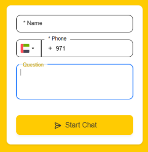
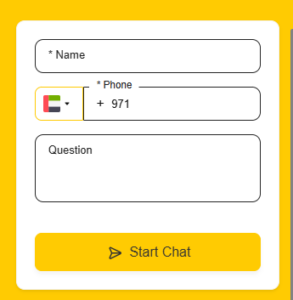
A chat form field with the focus state highlighted and without it.
How does focus order affect navigation?
Focus state and focus order are not the same. The indicator’s appearance is the focus state, and focus order is the order in which the content is presented.
When online navigation is logical, it feels natural; if the order is broken, everything becomes confusing.
Some common problems that can cause focus to be broken are:
- Using positive tabindex values will override the natural DOM order.
- Adding interactive elements to the page with JavaScript without managing where focus moves after they appear.
- Modals and dropdowns won’t lock focus correctly.
- Hidden elements remain in the tab order.
Most of the focus order issues can be solved by not altering the default DOM focus order.
The element’s tab index is 0, so it appears before elements with a higher tab index. Completely out of tab order (focusable by program): Tabindex=”-1″
How do you test focus states on your own website?
Testing focus is quick and easy to perform and does not require special tools or skills.
First, go to your website, and then drag the mouse to one side and press Tab several times.
See if you can:
- See what’s being focused.
- Try to see if the focus moves in a logical sequence (top to bottom, left to right).
- Navigate through every button, link, and form field using only the keyboard itself.
- Check if the focus shifts when the modal is opened and closed.
You can use free tools like WAVE and the Axe browser extension for a more detailed check. These will flag broken focus indicators.
How Inter Smart builds websites with accessibility in focus
Accessibility is an integral part of how Inter Smart builds things.
As a web development company in Dubai, Inter Smart serves all UAE businesses that require their websites to function well for all their users. This includes appropriate focus states from the beginning, structural consistency in HTML, and elements that are keyboard-accessible and consistently respond to user input throughout the site.
The outcome is websites that are accessible to consumers with accessibility impairments, search engine-friendly, and good for the brand. The easier it is for everyone to navigate the site, the better it will convert. This is what is important.
If accessibility is not mentioned yet with your preferred web development company, it’s important to bring it up.
Inter Smart constructs websites that already have this answer. Get in touch to find out how.
Key Takeaways
- A focus state is the visual indicator that shows which element is currently selected with the keyboard.
- WCAG 2.4.7 (Level AA) requires a visible focus indicator. WCAG 2.2 strengthened this with size and contrast requirements in 2.4.11 and 2.4.13.
- Removing the default browser outline without replacing it is the most common mistake. The :focus-visible CSS selector lets you customise focus styles for keyboard users without affecting mouse users.
- Focus order matters as much as focus appearance. Keep HTML structure logical, avoid positive tabindex values, and manage focus in dynamic content like modals.
- You can test focus states yourself by tabbing through your site. Lighthouse and WAVE provide more detailed audits.
- Good focus states improve accessibility, support SEO, and make the site better for all users.

Get A Call back from Our Expert
Need tailored guidance or have specific questions? Simply request a callback, and one of our knowledgeable experts will reach out to you at a time that suits your schedule.