Variable Fonts and Their Impact on Modern Web Design
- October 5, 2026
- Post By: Alex Mariyan Sebastian
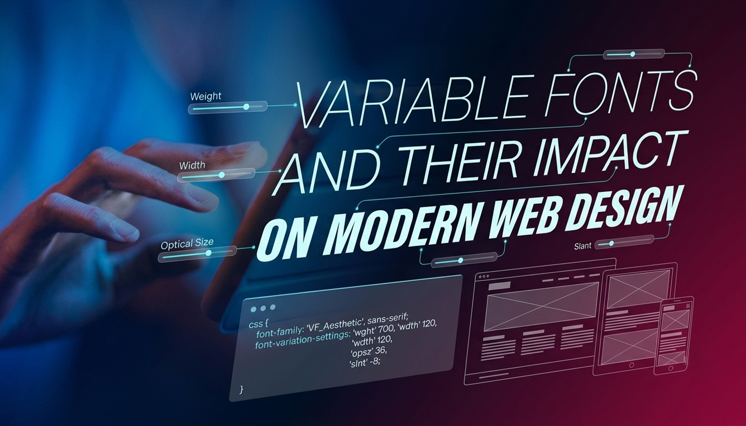
Remember the days when you had to collect every possible variation of a font to design a typeface? It’s almost a thing of the past now.
Variable fonts are a single font file that contains an entire range of styles.
This one file now does what used to take four, eight, or even more separate files. This change clearly affects how pages load, how flexible the design can be, and the look and feel of today’s sites.
Variable fonts aren’t a niche developer feature. They’re now used by default on Google Fonts and supported by every major browser.
| What is a variable font? A variable font is one font file. It can be changed to fit several styles. Those styles can shift on set axes. For example, the weight, the width, and the slant may all vary.
That means you do not need a new download for every style. You can tune the appearance with CSS.
Source: Google Fonts |
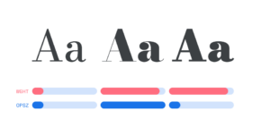
What’s the difference between variable fonts and regular fonts?
With traditional fonts, each style is its own file. Regular, Bold, Italic, and Bold Italic: that’s already four files. Add a Light and a Medium, and it doubles. Each file has to be downloaded before the text renders on screen. In the days before variable fonts, each style was a different font file.
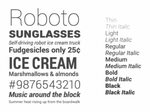
Roboto typeface family with different variations
Variable fonts allow all styles to be in one file.
That file size difference matters. Fonts are often the heaviest assets on a page after images.
How do variable fonts actually work?
Every variable font has a default style, usually Regular. From there, it exposes one or more axes that let you adjust the design continuously.
The five standard axes are:
- Weight (wght) – controls how light or heavy the letterforms are
- Width (wdth) – makes letters narrower or wider
- Slant (slnt) – tilts the letterforms without switching to a separate italic file
- Italic (ital) – switches between roman and true italic styles
- Optical Size (opsz) – adjusts letterform detail for the size it’s displayed at
Some fonts also include custom axes. Roboto Flex, for example, has a Grade axis (GRAD) that adjusts visual weight without changing the width of the text.
What is the performance impact on a website?
If using static fonts, the page load can be 500 KB or more before content is loaded, depending on the number of fonts loaded. This results in slower rendering, higher time to first meaningful paint and layout shifts due to late fonts.
Variable fonts mitigate that issue. A single file will do for all weights and widths. The browser doesn’t have to wait for a second or third font request before rendering the page correctly.
There’s a caveat here, however: if you are only using a single font style, it is possible that using a variable font will not save the file size; the variable font’s file will have more data by design. Where more than one weight or width is used, the gains are most evident.
How do variable fonts improve design quality?
Beyond performance, variable fonts give designers control that static fonts simply can’t offer.
Responsive typography becomes genuinely flexible. Instead of switching between predefined weights at breakpoints, you can map font weight or width to viewport size continuously. A headline can get slightly condensed as the screen narrows, keeping the layout intact without a hard visual jump.
Optical sizing is another practical benefit. The opsz axis adjusts the letterform detail based on display size. Small text gets simplified strokes for legibility. Large headings get refined details that would look too delicate at small sizes. The browser can handle this automatically with font-optical-sizing: auto in CSS.
For brands with strict typographic standards, variable fonts mean every weight between Regular and Bold is available, not just the ones the type foundry chose to release. A brand using weight 350 instead of 300 or 400 is a small detail. Over a full page, those small details add up.
Are variable fonts supported across all browsers?
Yes. In 2020, variable fonts began to be supported in all major browsers. They are treated correctly by Chrome, Firefox, Safari, and Edge.
The recommended pattern is to use the CSS @supports rule. If the browser supports variable fonts, it loads the variable file. If it doesn’t, it gets static fallbacks. That way, older browsers still work, and modern browsers get the full experience.
Google Fonts handles this automatically. When you request a variable font through the Google Fonts API, modern browsers receive the variable file and older browsers receive static fonts, with no extra work required on your end.
How does this apply to web design in Dubai?
Dubai has a rapidly changing and image-centric market. E-commerce companies, hospitality brands, property developers, and luxury brands generally put a lot of effort into the design of their web pages. Typography is an integral part of that.
In Dubai, web designers can utilise variable fonts to create aesthetically pleasing and speedy websites, thanks to their flexibility. A single condensed typeface can be used to change the weight of the font when needed across different screen sizes, while still appearing premium and not requiring the loading of five font files.
But performance is important too. The majority of UAE users are on 4G or 5G networks when they use their mobile to browse. Lower bounce rates and more visitors staying and converting, as pages load faster when the font file is one variable instead of multiple static font files.
What should you watch out for when using variable fonts?
Variable fonts might not be anything too complex, but there are a couple of things that need to be done right.
- font-variation-settings is not inherited between elements like other CSS properties. A child’s slant returns to default if it is set on a parent and a grade on a child. The solution is to pass values down the cascade using CSS custom properties (variables).
- Not all fonts can be used as a variable font. Check the axes a font supports by looking at them with a tool like Wakamai Fondue, or use the Google Fonts variable font filter to view the axes a font contains.
- If you are loading from Google Fonts, include a preconnect link to fonts.gstatic.com in your HTML head. It informs the browser about the location of the font ahead of time to reduce loading time.
How Inter Smart uses variable fonts in web design projects
Inter Smart is a web design agency in Dubai that builds websites where performance and visual quality work together, not against each other.
Variable fonts are part of how Inter Smart delivers that balance. Where typography is a key part of the brand, as is often the case, switching to variable fonts helps to decrease page size, provide greater typographic control for designers and avoids debilitating file-loading overheads that static font stacks cause.
All of the decisions in a project have a rationale to support them: fonts to use, axes to expose, what to do about falling back to old devices. This attention to detail is what makes a site perform well and a site that doesn’t.
Whether you are designing a new website or redesigning an existing site, and you want to pay attention to typography quality and performance, contact Inter Smart.
Key Takeaways
- A variable font is one file that replaces many. It stores multiple styles along continuous axes like weight, width, and slant.
- File size drops significantly when multiple styles are needed. Real-world tests show up to 88% reduction compared to loading equivalent static fonts.
- All major browsers support variable fonts. Fallback patterns exist for older browsers using the @supports CSS rule.
- Performance gains are real. Fewer font requests mean faster rendering, which affects Core Web Vitals and search rankings.
- Design flexibility improves. Any weight value, continuous width adjustment, and optical sizing are all possible with a single file.
- Use CSS custom properties to carry font-variation-settings values through the cascade correctly.
- For web projects in Dubai and across the UAE, variable fonts reduce mobile load times and give designers finer typographic control for premium brand work.



Get A Call back from Our Expert
Need tailored guidance or have specific questions? Simply request a callback, and one of our knowledgeable experts will reach out to you at a time that suits your schedule.