Why Website Content and Design Should Work Together
- November 11, 2026
- Post By: Inter Smart's Content Team
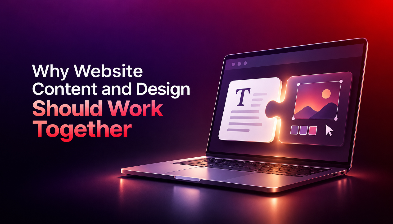
A beautiful website with weak words loses visitors. So does great writing inside a messy layout.
Content on the website guides the user, builds trust, and ensures the user understands what you offer. Both content and design have their own roles; considering both at the same time improves the website’s performance and users’ intent to act.
In this guide, we will examine why design and content should always be considered together and the issues that arise if they are treated separately. We will also look at the aspects to consider while making design and content decisions, especially with respect to businesses in Dubai.
| In summary: Website content and design should work together because visitors judge a page in seconds, scan instead of reading every word, and leave when the message and the layout disagree. Content gives the page meaning. Design gives it structure. Together they make a site clear, credible, and easy to act on. |
What does it mean for content and design to work together?
It means words and visuals working in tandem to achieve the same result.
Content is words, pictures, videos, and even the labels that convey your message. Design is the page layout, colours, font, and spacing, along with site navigation. Neither can exist without the other:
- A good headline must be accompanied by the right size and space so it can be seen.
- A structure of the page requires actual content to give it form.
- The design of the page is ineffective unless the user knows the effect of clicking on a button.
When one person writes first and another designs later, gaps appear. Text gets squeezed into boxes built for something else. Filler sits where the main message should be.
Why do visitors care about this so much?
People make decisions quickly and don’t read much.
The Nielsen Norman Group discovered that 79% of test users always scanned a new page. Only 16% of people read it word by word.
The same study tested what helps. Concise text enhanced usability by 58%. It was enhanced by 47% through the use of a scannable layout. It was improved by 124% by using short text, a scannable layout, and plain language. The biggest improvement came from combining the components.
A first impression forms even faster. In Google researchers‘ study, they found that within 50 milliseconds, people determined the attractiveness of a website. Websites that had a simple design and familiar layout were considered to be the most aesthetically pleasing.
Let’s look at the three approaches:
| Approach | What visitors see | Typical result |
| Good content, weak design | Useful text packed into dense blocks with no clear next step | People skim, miss key points, and leave |
| Strong design, weak content | Polished visuals with vague headlines and generic copy | People like the look but cannot tell what you offer |
| Content and design together | A clear headline, short sections, and a visible button | People understand quickly and know what to do next |
Does it affect Google rankings?
Yes, in a few ways. According to Google, their algorithms prioritise people-first content that is helpful and reliable. It also recommends that site owners deliver an excellent page experience in various aspects of the page.
Page titles and headings are considered part of the main content of a page by Google. It also poses the question: Does the main heading succinctly summarise the page without embellishment? Headings are a writing and design choice, so they are shared by both.
Another tip from Google: There’s no ideal word count. The length of a page can be extended as long as the topic requires. Then it needs to be easy to move through your layout at this length.
Why does this matter for businesses in Dubai?
A lot of the people visiting your website will be on their mobile phones, so all headlines, paragraphs, and buttons need to be mobile-friendly.
Language is yet another level. Many businesses in Dubai write content in Arabic and English. Arabic is RTL; therefore, a new layout is needed. The translated text is also a different length, causing buttons and headings to break if they fit in English.
Google gives clear advice for multilingual sites. It suggests distinct URLs for distinct languages, one language per page, and allowing visitors to switch languages easily. It also alerts to redirect people off-site automatically, based on a “best guess” of language.
A website design firm in Dubai that makes plans for copy and configuration can identify these concerns prior to launch.
What goes wrong when content and design are built separately?
- Mock-ups contain placeholder text, which is replaced with actual headlines later in the layout.
- Long headlines roll over into 3-4 lines on mobile.
- Buttons do not name what happens when they are clicked; they have the words “Submit” or “Click here.”
- Important information is embedded in the image and hard to read.
- The Arabic pages are laid out like the English pages, and the Arabic text is out of place.
- The main message is down; decoration is up.
How do you make content and design work together?
Follow these seven steps on any page:
- Set one goal per page. Choose one action, such as a call, an inquiry, or a purchase.
- Write the core message first. Draft the headline, a short intro, and the button label. Use plain words.
- Design with real copy. Replace placeholder text with the actual words as early as possible.
- Make the page easy to scan. Use clear subheadings, short paragraphs with one idea each, and bullets where a list helps.
- Match the button to the promise. If the page offers a free quote, the button should say “Get a free quote”.
- Test on a phone and in each language. Check headline length, button size, and line spacing with real text.
- Measure and refine. Use Google Analytics and Search Console to see where visitors leave. Then adjust the words and the layout together.
How does Inter Smart bring content and design together?
Inter Smart is a web designing company in Dubai that treats copy and layout as one job. The same brief is used for writers and designers. The team collaborates on the whole, from the first sketch, the headline, images and call to action.
The team at UAE’s top web designing company are capable of creating for mobile first and testing pages with actual English and Arabic text. Speed and structure are verified prior to launch.
In the end, the result is a site that quickly explains your business, matches your brand and provides a clear next step for all visitors.
If there are visitors that leave because your site is good, talk to Inter Smart.
Key Takeaways
- Content should complement the design in their understanding and actions.
- Most visitors scan. Nielsen Norman Group research showed that short text and a scannable layout enhanced usability up to 124%.
- It takes nothing more than a millisecond to make the first impression, and simple and familiar works best.
- Google values content that is helpful and people-centric, and page experience. Headings are considered main content.
- From the get-go, expect to see it on display on mobile screens and on English and Arabic pages in Dubai.
- Put your main message first, design with actual copy, and test with a phone before launching.
Get A Call back from Our Expert
Need tailored guidance or have specific questions? Simply request a callback, and one of our knowledgeable experts will reach out to you at a time that suits your schedule.