Colour Contrast Testing: A Technical Guide for Web Designers
- October 6, 2026
- Post By: Alex Mariyan Sebastian
One of the most common accessibility failures on web pages is poor colour contrast. Yet, it’s one of the simplest to fix.
Colour contrast testing compares the colour of the text to the background on your website to determine if it is readable. It sounds simple. However, if you make a mistake, a significant chunk of your traffic can’t read your messages.
This guide explains how to test for contrast using the WCAG contrast standards, what tools designers use to test contrast, and a process to identify and correct contrast problems before going live.
| What is colour contrast in web design? Colour contrast is the difference in luminance (perceived brightness) between a foreground colour (such as text) and its background. A contrast ratio is written as a number. |
What are the WCAG contrast requirements?
The Web Content Accessibility Guidelines (WCAG) are the international standard for web accessibility. They define two compliance levels for colour contrast: AA and AAA.
AA is the commonly required standard. AAA is the enhanced level, used when you want to go further. Here’s how the ratios break down by content type:
A higher ratio means more contrast. Black text on a white background has a ratio of 21:1 and easily passes both levels. Light grey text on a white background might only reach 2:1 and fails both.
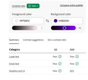
From Adobe Colour Contrast Checker
Big text has a lower threshold, as it is easier to read at lower contrast. The WCAG definition of large text is a cutoff of 24px, but bold text of 18.66px (roughly 14pt bold) is also considered large text.
One important point: the current WCAG 2.1 contrast formula has some known limitations. It doesn’t account perfectly for certain colour combinations. A newer system called APCA (Advanced Perceptual Contrast Algorithm) is in development as part of WCAG 3.0, and Chrome DevTools already lets you preview it. More on that below.
Why does contrast testing matter beyond compliance?
Accessibility standards exist for a reason.
There’s also a practical dimension. Google’s Lighthouse accessibility audit flags contrast failures directly. A poor score affects your overall Lighthouse rating, which can feed into site quality assessments. For any web design company in Dubai working on client sites, a contrast failure showing up in an audit is something clients notice.
Good contrast also just makes designs cleaner. When text is legible without effort, the layout feels more polished. It’s a quality signal, even for users who don’t have any visual impairment.
Which tools do web designers use to test colour contrast?
There are three tools worth knowing well. Each has its strengths. Using all three gives you coverage for almost every scenario you’ll encounter.
1. Chrome DevTools
If you use Chrome, you already have the most complete contrast testing toolkit available. It covers several methods:
- The Colour Picker in the Styles panel shows the contrast ratio live as you choose colours. It also has an autocorrect feature: if a colour fails, DevTools can find the nearest passing Colour automatically.
- The CSS Overview panel crawls your entire page and lists every contrast failure at once. This is the most efficient way to audit a full site before launch.
- The Lighthouse accessibility audit will perform an exhaustive accessibility check and provide a screenshot of each failed colour pair in the report.
- The Vision deficiency emulator simulates a site as it appears to a person with protanopia, deuteranopia, tritanopia (trichromacy) or achromatopsia (monochromacy). This is helpful if the information is only communicated in colour, an accessibility failure.
Chrome DevTools does have one limitation: it sometimes can’t detect intent when colours are layered or use transparency. That’s where the next two tools help.
2. Pika (macOS)
Pika is a system-level colour picker for macOS. Because it reads pixels directly from the screen rather than from the browser DOM, it works in situations where DevTools can’t:
- Text on a gradient background
- Text on an image
- Elements using CSS blend modes
- Semi-transparent overlays, like frosted glass effects
- Colours from outside the browser, such as a Figma or Sketch mockup
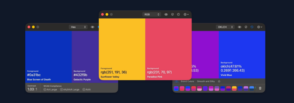
You manually select the two colours you want to compare, and Pika gives you the WCAG ratio instantly. For PC users, Microsoft PowerToys includes a Colour picker that covers some of the same ground, though with less contrast-specific detail.
3. VisBug
VisBug is a browser extension available for Chrome, Firefox, Edge, Brave, and Safari. Its accessibility inspect tool works like the DevTools hover tooltip, but with one key advantage: you can click multiple elements and keep all the contrast overlays visible at the same time.
This is especially useful during design reviews. If you’re checking a card component with a title, body text, icon, and button all using different Colour combinations, VisBug lets you see all of their contrast scores on screen simultaneously. DevTools only shows one at a time.
How to test Colour contrast step by step
Here’s a practical workflow for catching and fixing contrast issues at each stage of a project.
- Start in your design tool. Before writing a line of code, check your palette. Most modern design tools have accessibility plugins that calculate contrast ratios directly. Catch failures here, before they reach the browser.
- Use the DevTools CSS Overview at the start of development. Run it early, not just before launch. Catching contrast issues when styles are still being built is much faster than hunting them down in a finished site.
- Use the hover tooltip for spot checks. As you build components, activate the element inspector and hover over text elements. It takes two seconds per element and catches obvious issues immediately.
- For complex visual treatments (gradients, images, transparency), use Pika or manually sample colours with the DevTools Colour picker. These situations need manual attention. DevTools may not detect the actual contrast in these cases.
- For components with multiple text elements, use VisBug to check all pairs at once. This is faster than checking each element individually through DevTools.
- Run a final Lighthouse audit before launch. It will flag any remaining failures and give you a screenshot of each one. Fix all flagged contrast issues before the site goes live.
- Check with the vision deficiency emulator. View the site through each emulation mode. If any information is conveyed through colour alone (like a red error state with no icon or label), fix it.
The method for fine-tuning Colours
Sometimes a Colour pair is close to passing but not quite there. You don’t need to start over. There’s a faster way.
This technique, described by Google’s Adam Argyle as “bump bump till you pass,” works like this:
- Open DevTools and click on a colour value in the Styles panel to focus your cursor on it.
- Activate the hover tooltip with Ctrl+Shift+C (or Cmd+Shift+C on Mac) without clicking away from the colour value.
- Hover over the text element you’re testing.
- Use the up and down arrow keys on your keyboard to nudge the colour channel value higher or lower.
- Watch the contrast ratio update in real time until it passes the required threshold.
This works because your keyboard focus stays on the colour value in the Styles panel while your mouse controls which element is being evaluated. It’s much faster than manually editing hex values and checking again.
What’s APCA and should web designers know about it?
APCA stands for Advanced Perceptual Contrast Algorithm. It’s being developed as a replacement for the current WCAG 2.1 contrast formula and will be part of WCAG 3.0.
The current formula has a known limitation: it can flag some Colour pairs as failing even when they’re clearly readable to most people, and it can pass other pairs that are harder to read in practice. APCA is designed to be more accurate about how humans perceive contrast in real conditions.
You can preview APCA scores in Chrome DevTools today. Go to Settings, then Experiments, and enable “Advanced Perceptual Contrast Algorithm”. The colour picker and hover tooltip will switch from WCAG 2.1 ratios to APCA scores.
APCA isn’t a legal requirement yet. WCAG 2.1 AA is still the standard for compliance. But testing with APCA alongside WCAG 2.1 gives you a more complete picture of how readable your colour choices actually are.
How Inter Smart handles Colour contrast in web design projects
Colour contrast is tested on every project at design time before development commences, tested as a structural audit on build and verified with a Lighthouse run prior to launching on every project. In cases of complex visual treatments, gradients, transparency, images, etc. the actual contrast is tested instead of the theoretical colours with Pika.
Compliance with WCAG 2.1 AA can be a requirement for clients in regulated industries such as healthcare, finance and government. As a web designing company in UAE working across multiple sectors, Inter Smart ensures that accessibility standards are documented and verified for every deliverable.
If you’re a web design agency in Dubai and you want to deliver sites that hold up to accessibility scrutiny, contrast testing needs to be part of your standard process, not a last-minute check.
Inter Smart builds that process in from day one. Get in touch to find out how.
Key Takeaways
- WCAG 2.1 AA requires a 4.5:1 contrast ratio for body text and 3:1 for large text (24px or larger). These are the minimum standards for compliance.
- Chrome DevTools has five contrast testing tools built in: the colour picker, hover tooltip, CSS Overview, Lighthouse audit, and vision deficiency emulator. Use all of them.
- Pika (macOS) is the best tool for testing contrast on gradients, images, transparency, and colours outside the browser.
- VisBug lets you inspect multiple contrast pairs on screen at once. Use it for component reviews.
- The ‘bump until you pass’ technique in DevTools is the fastest way to fine-tune a colour that’s close to passing without starting over.
- APCA is the upcoming replacement for the WCAG 2.1 contrast formula. You can preview it in DevTools today under Experiments.
- Test at every stage: design, development, and pre-launch. Catching failures late is significantly more expensive than catching them early.



Get A Call back from Our Expert
Need tailored guidance or have specific questions? Simply request a callback, and one of our knowledgeable experts will reach out to you at a time that suits your schedule.